/ The Work of Designer - Baz Pringle
Concept
Graphic Design
Logo Design
3D Production

Concept
Graphic Design
Logo Design
3D Production
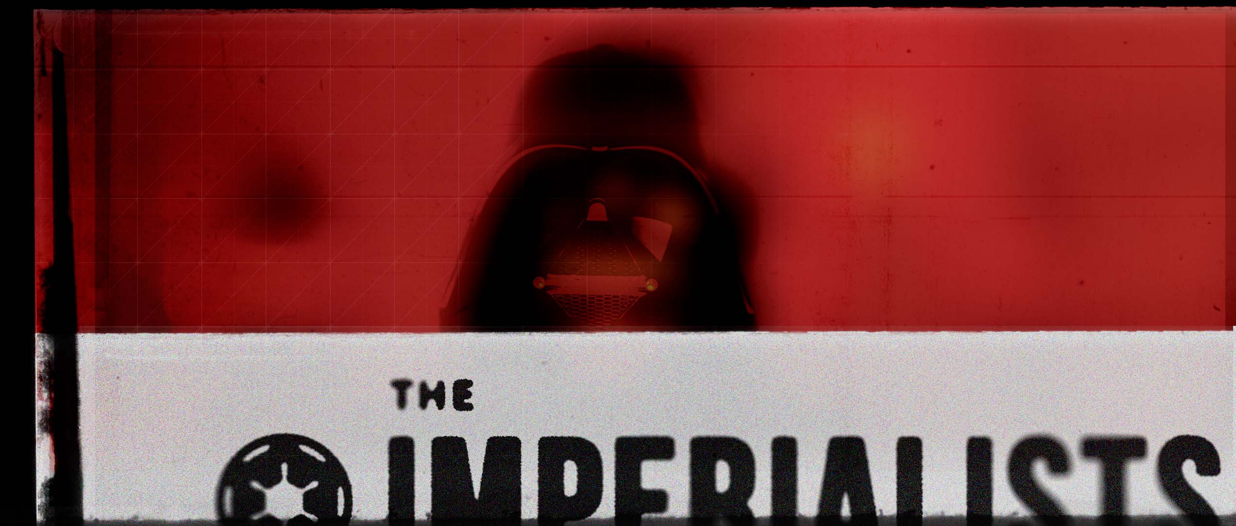
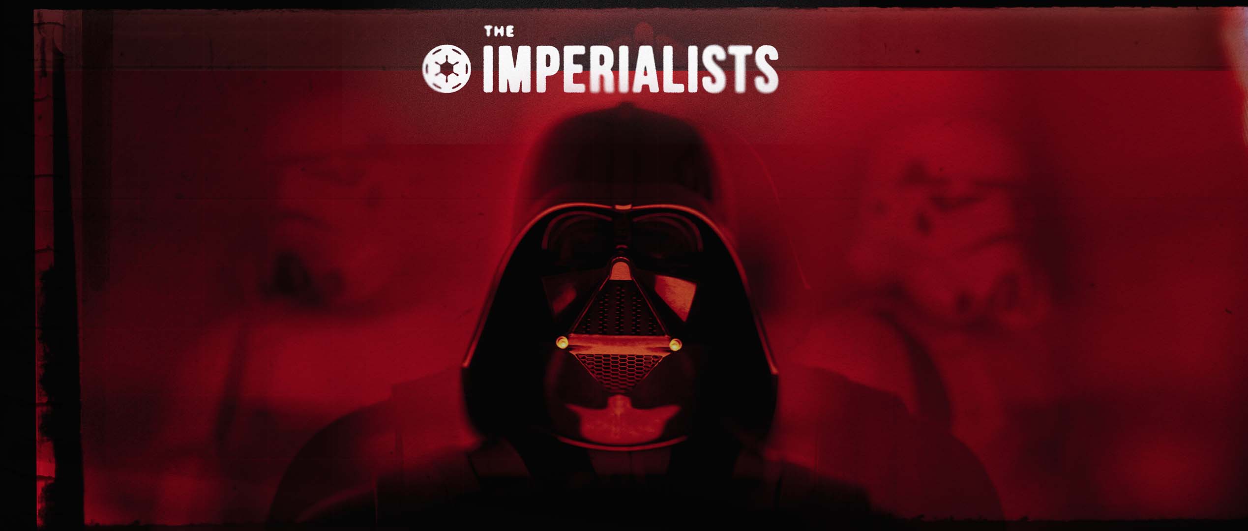
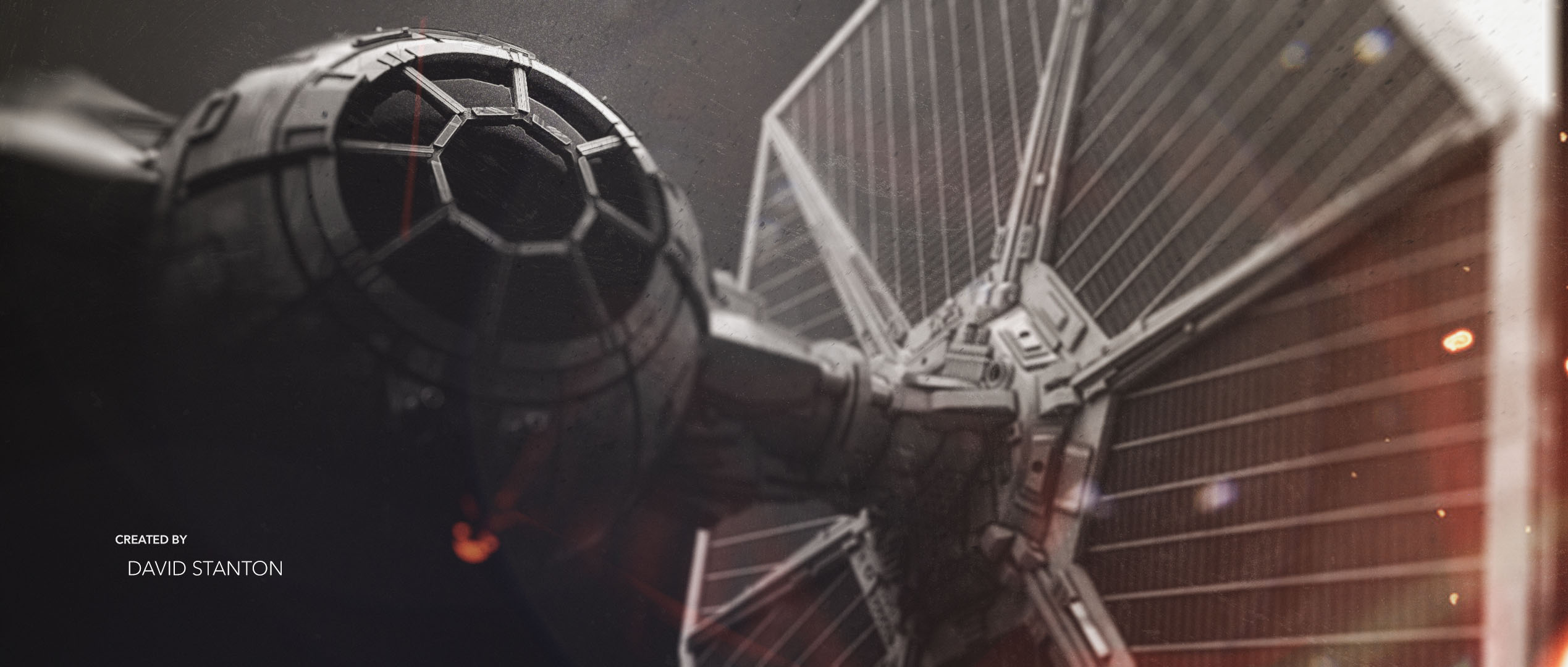
This look-development series explores a collection of graphic style frames for a fictional production set within George Lucas’ Star Wars universe. The project splits its visual identity across two distinct palettes: a high-contrast, deep red title sequence aesthetic and a stark, monochromatic space setting. The focus throughout this design study centres on combining bold typography layouts with heavy film grain, technical grid overlays, and raw atmospheric lighting.
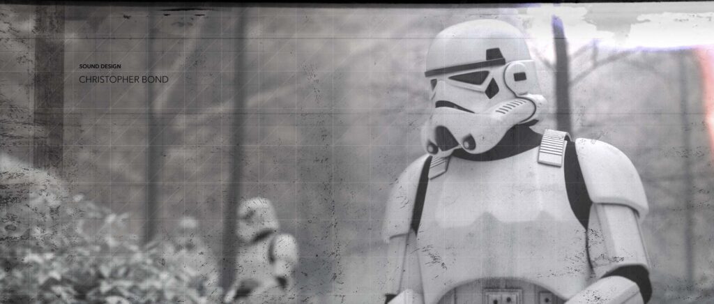
Original 3D models of Darth Vader and an Imperial Stormtrooper were created from scratch in Maya and Cinema 4D.
Stock Tie Fighter model by: IrfanCAYLI
Stock AT-AT model by: Greeble
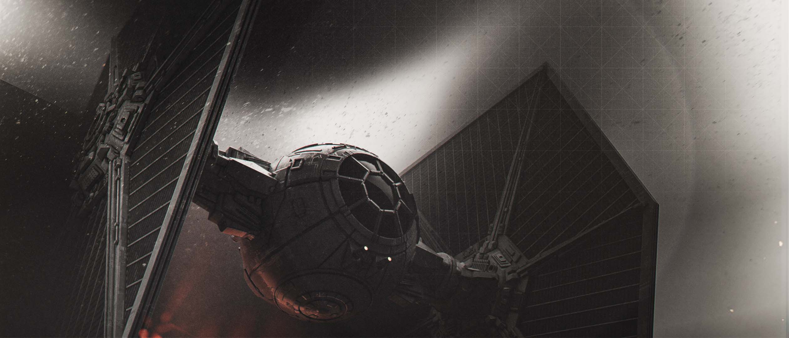
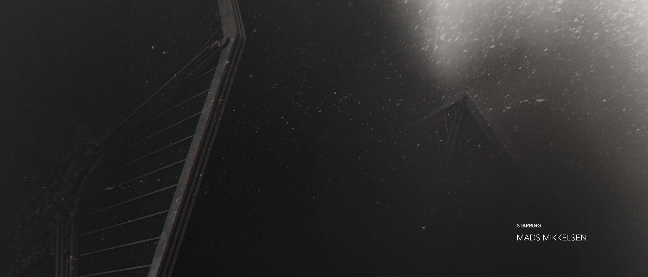
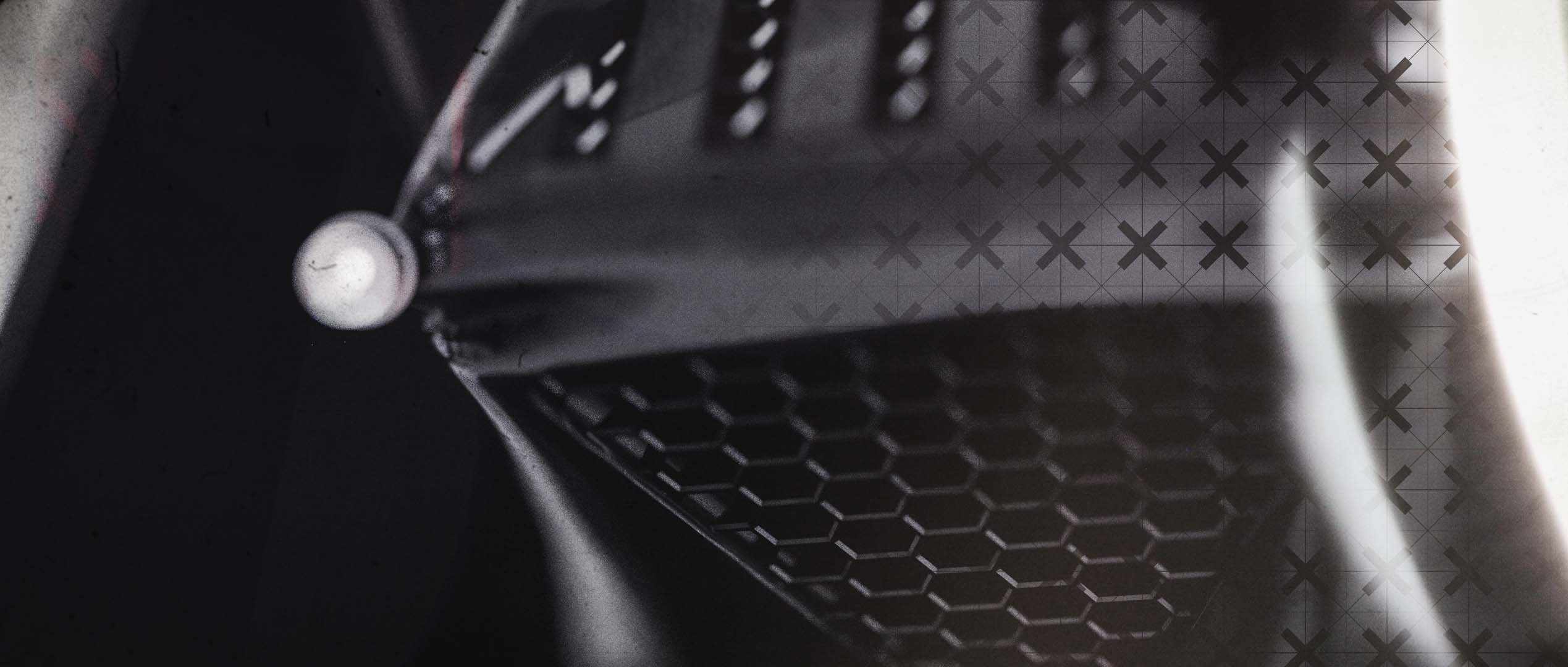
The multi-platform production pipeline features an assortment of bespoke and integrated assets. A detailed Imperial Stormtrooper was modelled from scratch inside Maya, while the Darth Vader asset was built entirely within Cinema 4D. To build out the surrounding fleet, these hero models were paired with high-quality stock geometry, incorporating a TIE Fighter and an AT-AT.
The final compositions were assembled and rendered using OTOY Octane inside Cinema 4D, utilising sharp anamorphic lens effects, volumetric lighting, and graphic texture layers to establish a dark, cinematic tone.
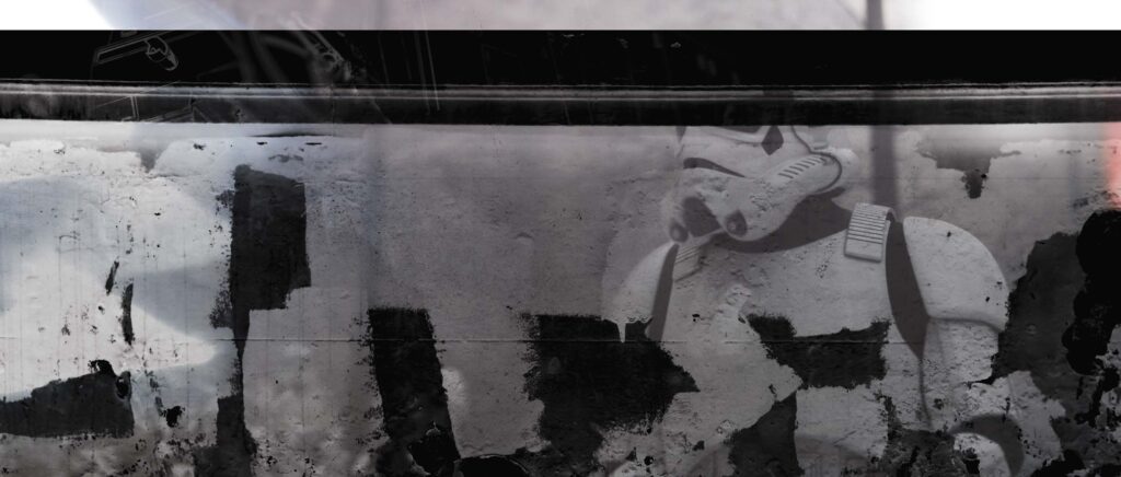
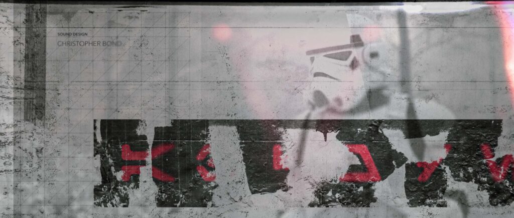
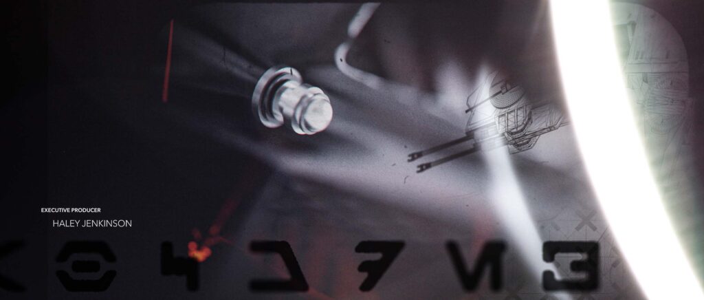
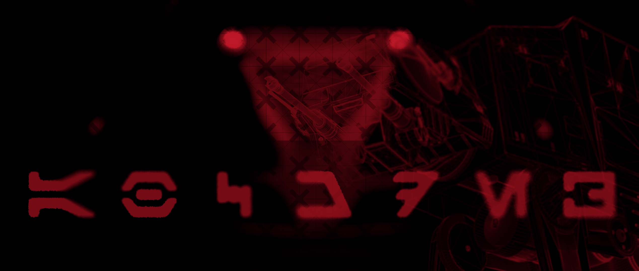
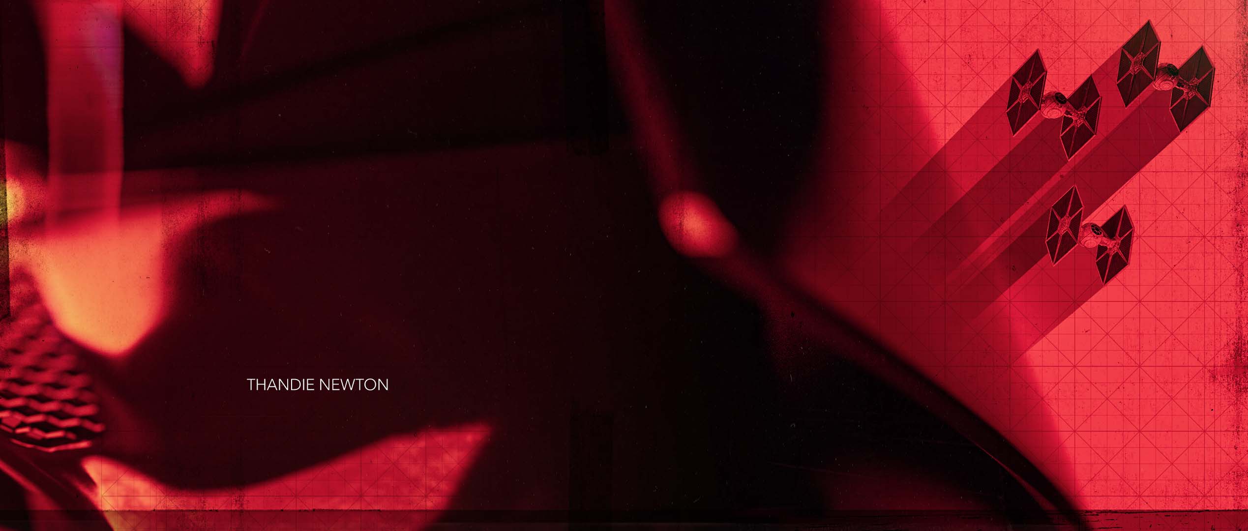
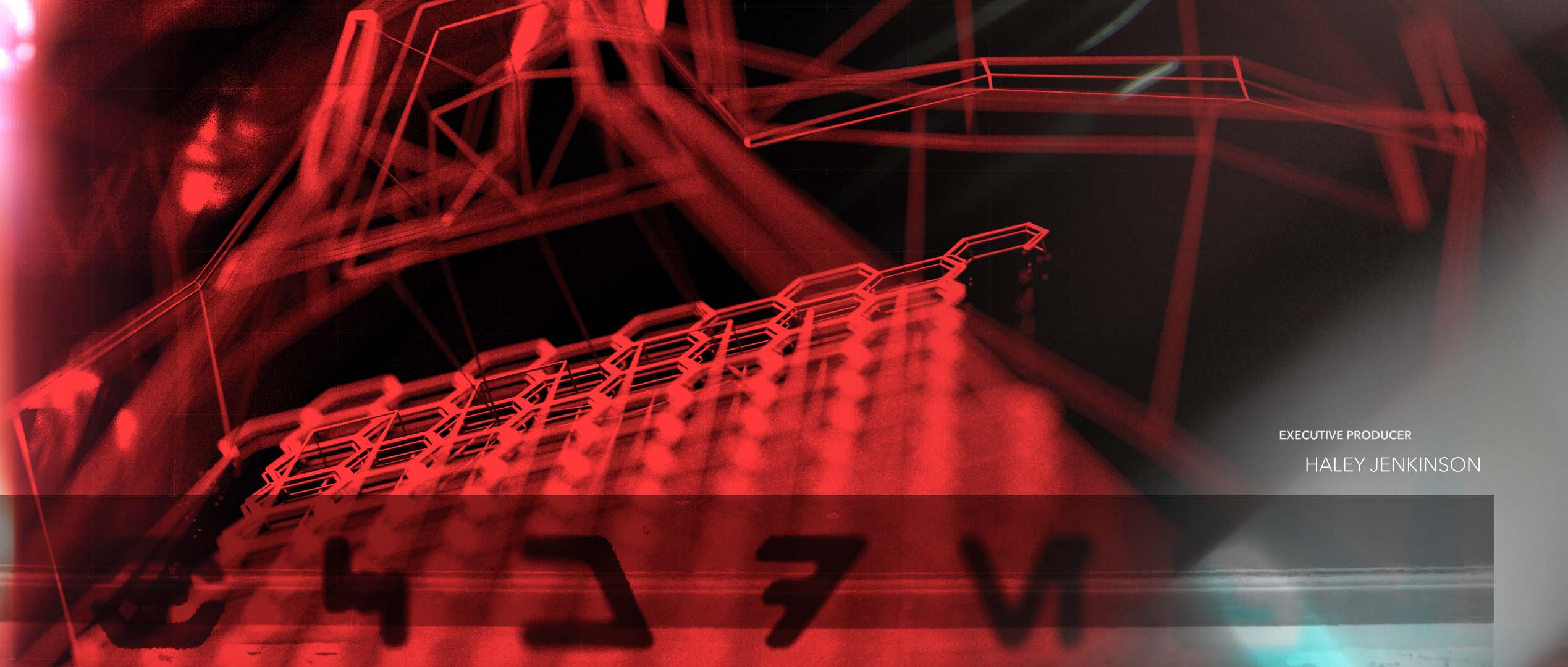
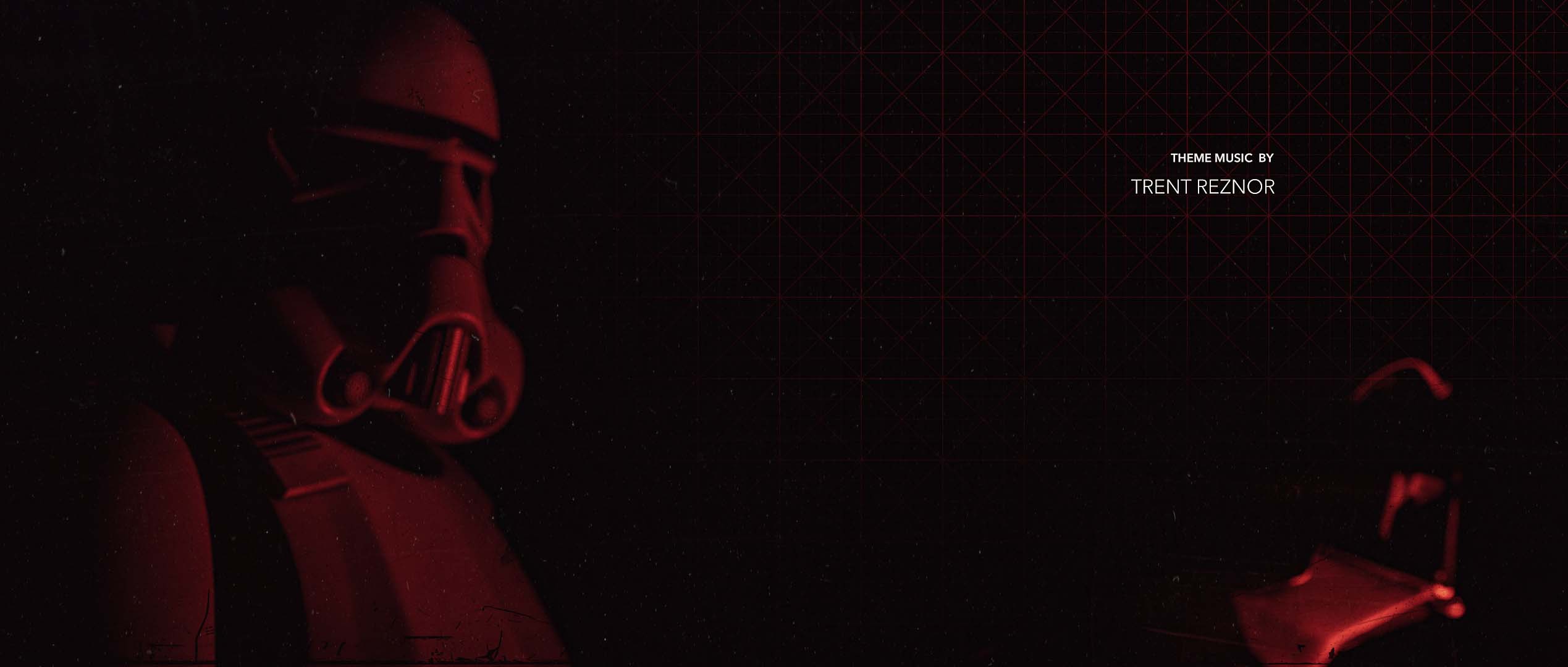
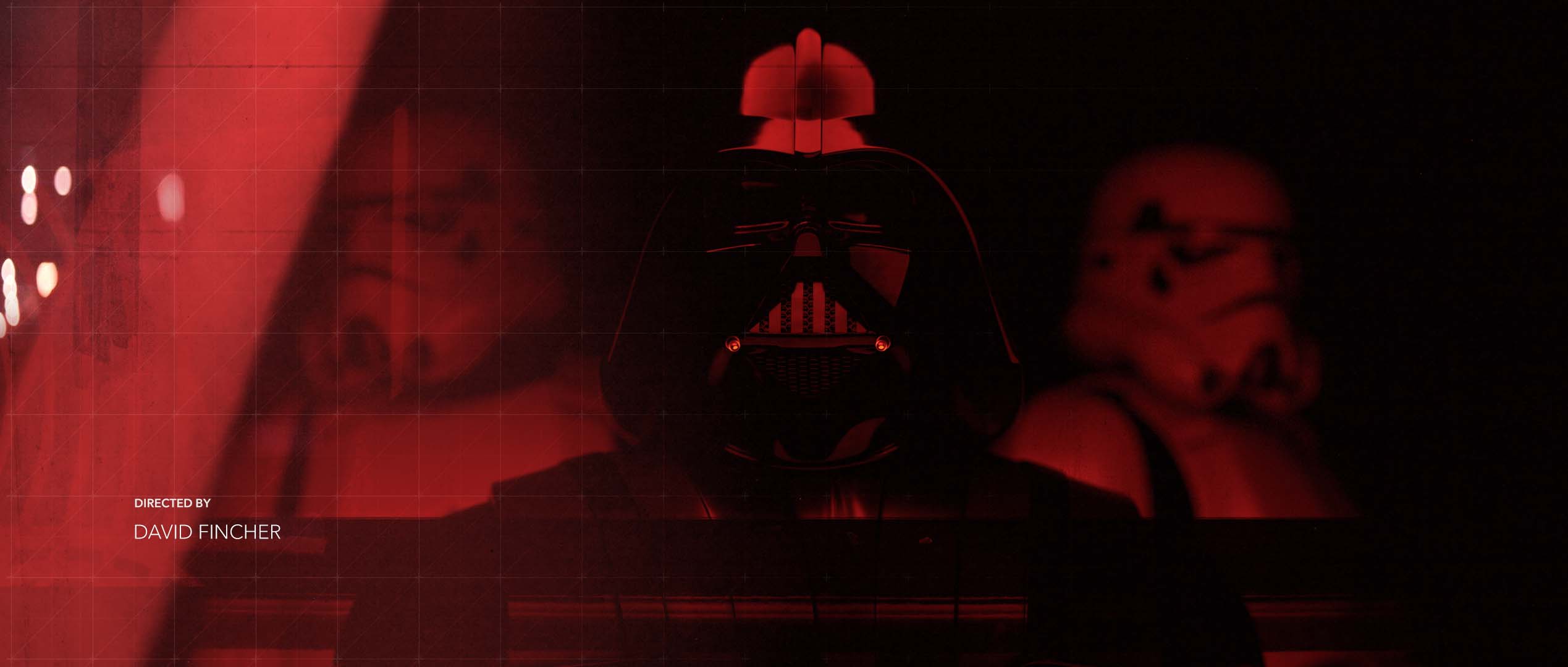
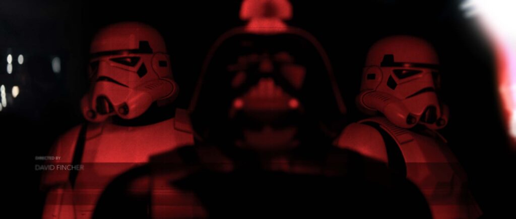
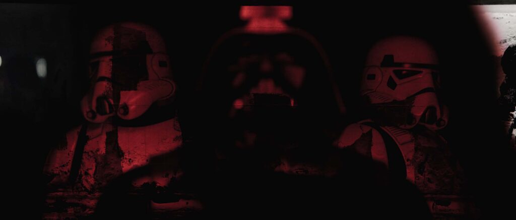
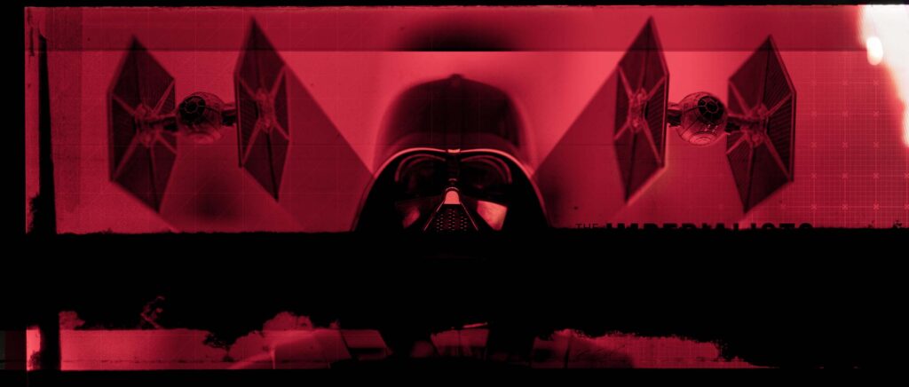
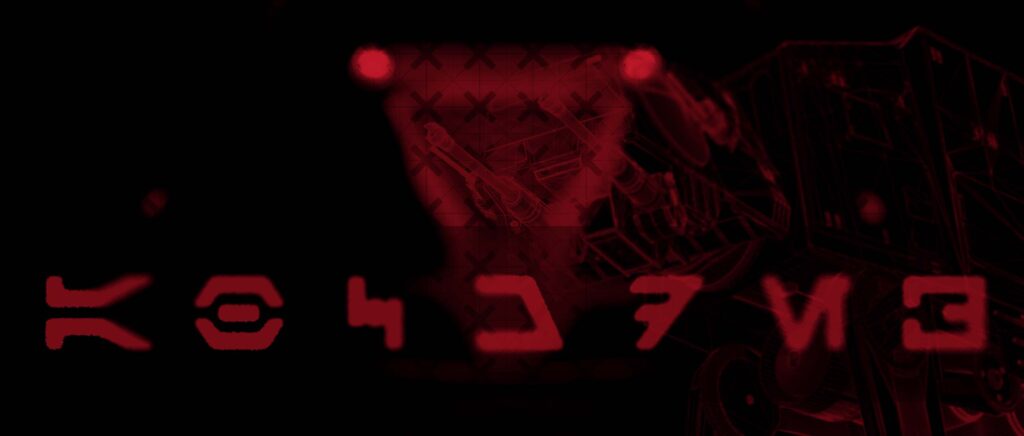
The high-contrast red style frames function as an intentional visual counterpoint to the predominantly monochromatic grey sequences. Within these crimson compositions, a highly shallow depth of field acts as a targeted layout tool to systematically direct the viewer’s attention. The optical focus isolates the stark armor of the flanking Stormtroopers before shifting clarity onto the menacing central silhouette of Lord Vader.
The final presentation phase introduces the custom production logo, which is engineered to unify with the underlying film grain and technical grid matrices. Rather than relying on pristine digital typography, the graphic branding incorporates a simulated ink bleed treatment. This technique subtly degrades and roughens the sharp edges of the letterforms, allowing the logo text to blend naturally with the gritty, weathered textures of the style frames.